
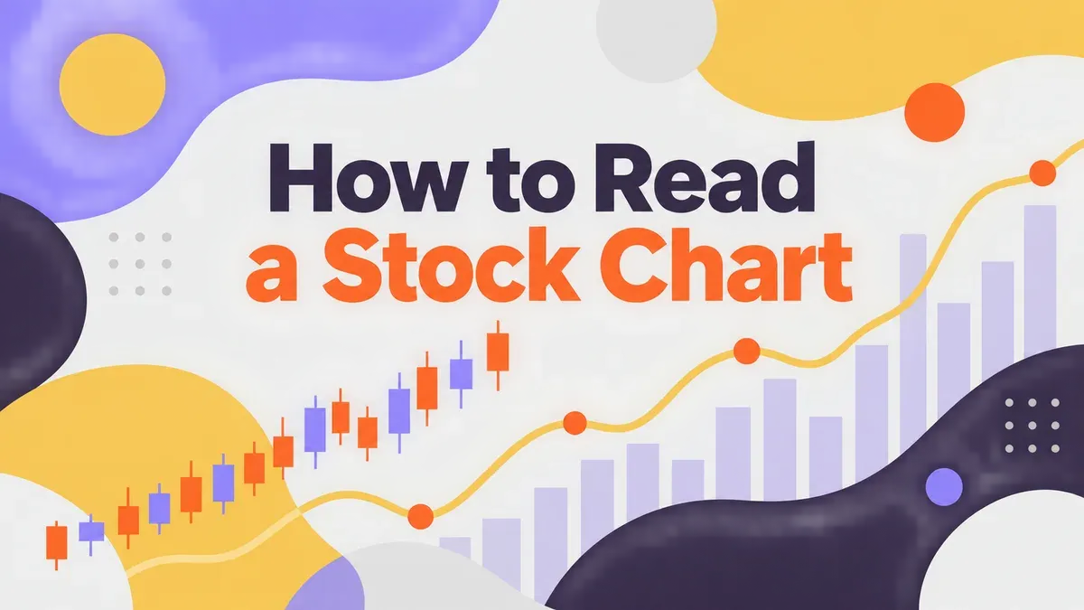
How to Read a Stock Chart: 5 Best Things to Know
Someone in your life says "the chart looks ugly today" or "it broke out on volume" and you nod like you know exactly what that means. You don't. You've opened an app, seen a jagged green-and-red line jumping around, and closed it again because you never learned how to read a stock chart in the first place. That's not a knowledge gap you caused. Nobody ever sat you down and explained what a stock chart actually shows.
This guide is that sit-down conversation. You will learn how to read a stock chart in plain terms: what the lines and bars mean, why the same stock can look completely different depending on which site you're using, and what a chart can never tell you, no matter how long you stare at it. No trading signals, no "buy here, sell there" advice. Just the literacy you were missing.
Quick Answer: How to Read a Stock Chart
Quick answer: a stock chart plots a company's share price (vertical axis) against time (horizontal axis). Most charts also show volume, the number of shares traded, as bars underneath the price line. Candlestick charts add four extra data points per time period: the open, high, low, and close price. A chart is a record of where a price has already been. It is not a prediction of where it's going next, and nobody, no matter how sophisticated their tools, can read a stock chart and know the future for certain.
What a Stock Chart Actually Shows You
Strip away the jargon and a stock chart is just two pieces of information plotted against each other: price on the vertical axis, time on the horizontal axis. That's the whole foundation. Everything else, candles, volume bars, moving-average lines, is extra detail layered on top of that same basic grid.
When you first learn how to read a stock chart, start by finding those two axes before anything else. Look at the vertical axis and ask what range of prices you're looking at. Look at the horizontal axis and ask what time period you're viewing: one day, one month, five years. The same stock can look dramatically different depending on how far that time axis stretches, which is exactly why zooming out before you react to anything is one of the first habits worth building.
Line Charts vs. Candlestick Charts: Which One You're Probably Seeing
Most beginner investors run into two chart styles. A line chart is the simplest version: it connects the closing price of each day (or week, or month) into a single continuous line. It's easy to scan quickly, but it throws away information about what happened inside each trading day.
A candlestick chart keeps that information. Instead of one point per day, you get a small shape, a candle, that holds four numbers at once.
What Each Candle Actually Means
Every candle on the chart represents one time period (often a day) and shows four prices from that period: the open (where the price started), the high (the highest point it reached), the low (the lowest point it reached), and the close (where it ended). The thick middle part of the candle, called the body, spans the distance between the open and the close. The thin lines above and below, called wicks, mark the high and low.
What the Colors Mean (and Why They're Not Universal)
Most charting tools color a candle one way when the close is higher than the open, and a different way when the close is lower than the open. On many U.S. platforms that means green for a higher close and red for a lower one, but this is a style choice, not a rule. Some platforms use filled (solid) candles for a lower close and hollow (outlined) candles for a higher close instead of color at all. The first time you read a stock chart on a new platform, check the legend before assuming the colors mean what they meant on the last app you used.
Why Volume Bars Matter as Much as the Price Line
Underneath most price charts, you'll see a row of vertical bars, usually shorter and less colorful than the price section above them. That's volume: the number of shares that changed hands during each time period.
Volume on its own doesn't tell you to do anything. What it does is give you a sense of how many people were actually participating in a given price move. A price jump on a day with unusually high volume reflects a lot of buying and selling activity behind it. The exact same jump on a quiet, low-volume day reflects far fewer trades making that move happen. Neither fact tells you what happens next. It's simply more context for understanding what you're looking at, the same way knowing how many people attended an event tells you something about the event without telling you what happens at the next one.
Why the Same Stock Can Look Completely Different on Two Charts
Here's a habit worth building early: before you react to any stock chart, check what time frame you're actually looking at. A stock that looks like it's falling apart on a one-week chart can look perfectly steady on a five-year chart of the same company. Neither view is wrong. They're just answering different questions.
This isn't just a hunch. Researchers at Radboud University ran a controlled study of 1,041 retail investors and found that showing people shorter time-frame price charts led to meaningfully more trading activity than showing the same investors longer time-frame charts of the same assets. More trading meant more transaction fees, which quietly ate into real returns, even though the shorter view didn't change how much risk people were actually willing to take on. The chart's time frame changed behavior, not just perception, and the behavior change cost real money (Journal of Banking and Finance, "History Matters: How Short-Term Price Charts Hurt Investment Performance").
The practical takeaway: when you catch yourself reacting strongly to a chart, zoom out before you do anything else. Check the one-year or five-year view of the same stock before you decide the one-week view is telling you something urgent.
How to Read a Stock Chart Against a Benchmark, Not Alone
A single stock's chart in isolation is missing half the story. Did that stock drop because something specific happened to the company, or did the entire market drop that same week? You can't tell from one chart alone.
The fix is to pull up a benchmark chart, like the S&P 500, next to the stock you're actually trying to understand. If both lines move together, the stock is probably just following the broader market. If the stock moves a lot more, or in the opposite direction, that's a signal the story is specific to that company, not the market as a whole. WealthMore has a full explainer on what these benchmarks actually track and how to find your own portfolio's numbers in this guide to what the S&P 500 measures, which pairs well with the chart-reading skills in this one.
What a Stock Chart Can't Tell You
This is the part that matters most, and it's the part most "how to read a stock chart" guides skip entirely. A chart is a historical record. It shows you where a price has already been. It does not show you where a price is going next, and nobody, not a professional trader, not a sophisticated algorithm, not a textbook pattern, can read a chart and know the future for certain.
FINRA's own investor education content makes this point directly in its explanation of momentum investing, a strategy built heavily around reading charts and price trends. FINRA notes that momentum indicators can give false signals in volatile markets, and that even experienced investors using advanced tools cannot anticipate unexpected geopolitical or economic shocks that move prices (FINRA, "What Is Momentum Investing?"). If professional tools built specifically to read charts for trading signals still can't see shocks coming, a beginner studying the same chart shape is in exactly the same position. The chart shows the past clearly. The future stays unwritten no matter how carefully you study the candles.
This is also why WealthMore's own Trade for Income curriculum spends real class time on sector trends and portfolio mechanics covered in depth in the published guide on what sector rotation investing actually means, rather than teaching chart patterns as a shortcut. Context and mechanics hold up over time. A single candle shape does not.
What This Guide Doesn't Cover, and Why
In the interest of staying squarely in education, not advice, here's what this guide deliberately leaves out, and why each one is out of scope:
- Candlestick pattern names (like "head and shoulders" or "doji") presented as predictive signals. These patterns are real and widely discussed, but treating any chart shape as a reliable buy-or-sell trigger crosses from literacy into a market-timing call, which this guide isn't built to make.
- Moving-average crossover strategies as trade signals. Moving averages are a real, commonly used tool, but deciding exactly when to act on one is a specific trading strategy, not a chart-reading basics topic.
- Whether any specific stock's current chart means you should buy, sell, or hold it. That call depends on your whole financial picture, not a chart shape, and belongs in a real conversation with a financial professional, not a blog post.
Learning to actually use chart patterns as part of a full trading strategy is a specialized skill. It's taught live, with real back-and-forth and context, inside a structured curriculum, not picked up from a single article.
A Simple First Pass: How to Read Any Stock Chart in 4 Steps
Next time you open a stock chart, walk through this order instead of just reacting to the shape of the line.
- Step 1: Find the two axes. Confirm the price range on the vertical axis and the time period on the horizontal axis before you look at anything else.
- Step 2: Check the time frame. Look at the one-week view, then the one-year or five-year view of the same stock. See if the "story" the chart seems to be telling changes.
- Step 3: Glance at volume. Is the move you're reacting to backed by a lot of trading activity, or very little? That's context, not an instruction.
- Step 4: Pull up a benchmark. Compare the stock's chart to a broad index like the S&P 500 over the same time period to see whether you're looking at a company-specific story or a market-wide one.
Four steps, done in that order, turn a confusing jumble of candles into something you can actually describe in plain words. That's the whole goal of learning to read a stock chart: understanding what you're looking at, not predicting what happens next.
Common Mistakes Beginners Make When They First Try to Read a Stock Chart
Almost everyone makes the same handful of mistakes the first few times they try to read a stock chart. Knowing them in advance saves you from a lot of unnecessary panic.
The first mistake is treating a one-day or one-week chart as the whole story. A stock can dip 5% in a single rough afternoon and look alarming on a short chart, then barely register as a blip once you zoom out to a one-year view. Always check more than one time frame before you decide a move means anything.
The second mistake is assuming a chart's shape predicts what comes next. A chart that's been climbing steadily for months can still drop the next day. A chart that's been falling can turn around just as fast. The shape tells you the history. It never tells you the future, no matter how clean or obvious the pattern looks.
The third mistake is reading a chart with no benchmark in view. Without comparing a stock to something like the S&P 500 over the same stretch of time, you can't tell if you're looking at a company-specific story or just the whole market moving together. A stock chart in isolation is only half the picture.
The fourth mistake is confusing volume with a signal to act. High volume on a price move means more people were trading, not that the move is "confirmed" or safe to follow. Treat volume as one more piece of context, the same way you'd treat a weather forecast: useful background, not an instruction.
Once you can spot these four habits in yourself, reading a stock chart becomes a lot less stressful. You're not trying to predict anything. You're just getting comfortable with what you're actually looking at.
Frequently Asked Questions
What's the difference between a line chart and a candlestick chart?
A line chart connects only the closing price from each time period into a single line. A candlestick chart shows four prices per period (open, high, low, close) using small shapes called candles. Candlesticks hold more detail. Line charts are easier to scan quickly.
Why does the same stock chart look different depending on which site I use?
Different platforms default to different time frames, different candle colors, and sometimes different data sources for after-hours trading. The underlying price history is the same. The display choices are what change, so always check the time frame and legend before comparing two charts from different sites.
Do I need to know how to read a stock chart before I invest?
No. You can be a thoughtful, long-term investor without ever reading a chart closely. Chart literacy is useful context, especially for understanding what you already own, but it isn't a requirement to get started. WealthMore's members build this skill gradually, at their own pace, alongside everything else.
What do the colors on a candlestick chart mean?
Typically, one color (often green) means the price closed higher than it opened, and the other (often red) means it closed lower. Some platforms use filled versus hollow shapes instead. These are display conventions set by each platform, not a universal standard, so check the legend on whatever tool you're using.
Can a stock chart tell me whether to buy or sell?
A chart alone cannot tell you that, and no guide, including this one, can give you a personalized answer. A chart shows historical price movement. What you do with that information depends on your own goals, timeline, and full financial picture, which is exactly the kind of decision worth bringing to a real conversation with a financial professional rather than reading off a chart shape.
If this is the first time anyone has actually walked you through what you're looking at, you're not behind. Most people never get this explained to them at all. They just absorb bits and pieces from headlines and hope it adds up. ErikaBlair McGrew teaches Bloomberg Terminal instruction at Clark Atlanta University, the same professional software traders use to read these exact charts every day, after years spent on an actual trading floor as a VP at Merrill Lynch before she ever taught a classroom.
That combination, real trading-floor time plus years of teaching people who never got a financial head start, is why WealthMore builds its lessons from the ground up instead of assuming you already know the basics. You can read the fuller version of her own first-generation story in this piece on first generation wealth building.
Chart literacy is one small piece of a much bigger picture, understanding your own risk tolerance, your timeline, and how pieces like sector trends and benchmarks fit together. WealthMore's Trade for Income collection builds all of these skills together, step by step, with live sessions where you can actually ask questions instead of guessing alone. If you're ready to stop decoding charts by yourself, Join WealthMore Life and Legacy. Start building wealth with us →